Two identities become one Digital Experience
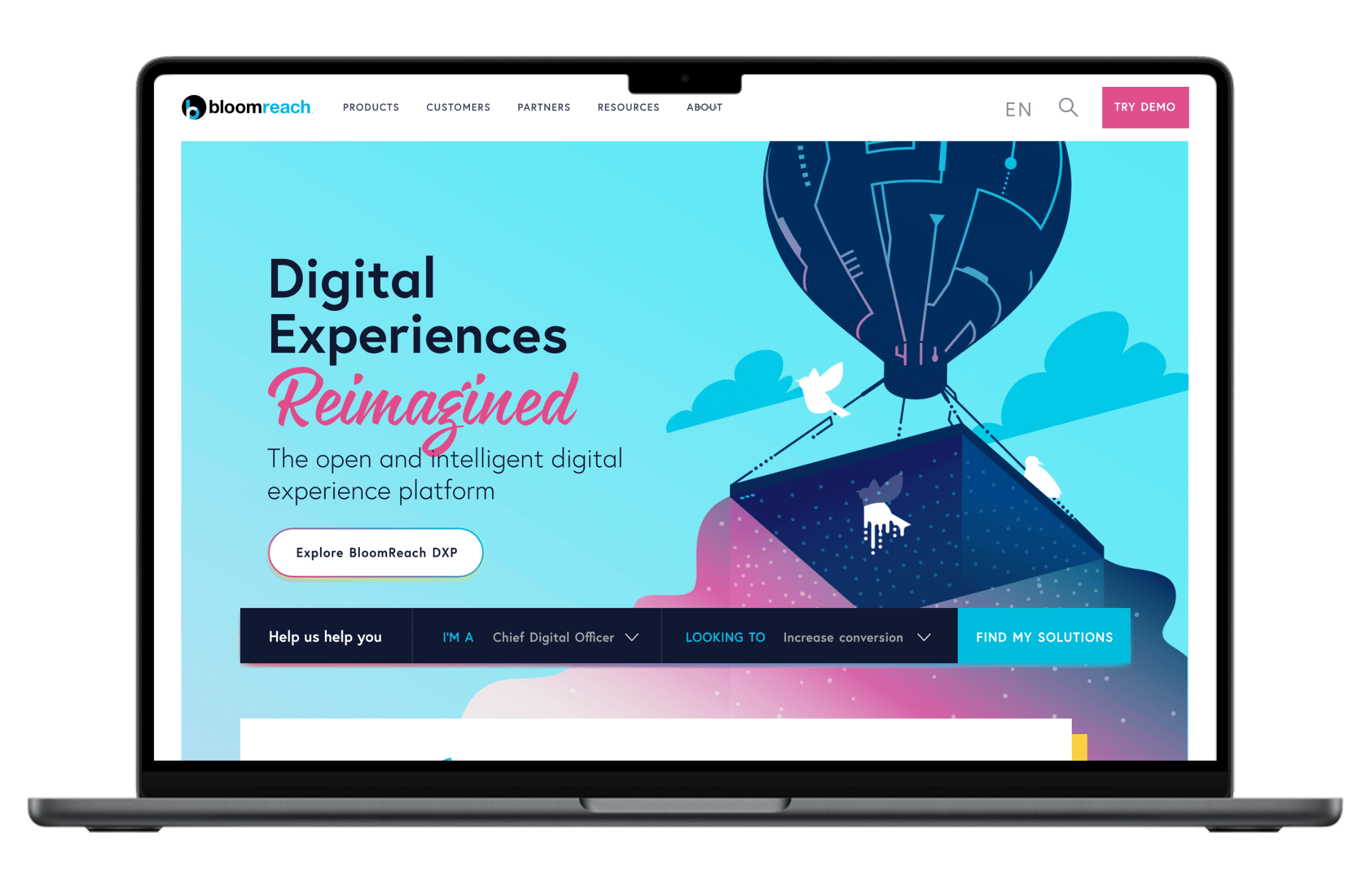
BloomReach Intelligent Balloon

When Bloomreach acquired Hippo, it was more than just merging two companies—it was about blending their digital experiences into something new, yet familiar. Our goal? Create a seamless integration that set a new standard in the industry.

Challenge

Unified, intuitive, personal: our journey

Imagine taking two distinct personalities and turning them into one—that's what we faced with Bloomreach and Hippo. As the Creative Lead on a cross-functional team, I had six months to craft a unified brand strategy that was more than just surface-deep. It was about designing an experience that felt intuitive, personal, and true to the spirit of both brands.

Approach

Balancing a paradox

We wanted the new Bloomreach experience to embody the idea of being "Bold & Light"—both dynamic and approachable. Through countless iterations and a solid foundation of user research, we redefined the look and feel of the platform. Think vibrant colors that break away from typical tech monotony, contemporary typography, and playful illustrations—elements that brought a human touch to the digital landscape.

Direction

The shop is open, and intelligent

But it wasn't just about aesthetics. We needed to make the platform smart, without leaning on the overused AI buzzwords. The "Open & Intelligent" ethos drove us to simplify complex functionalities, empowering users by making the intelligent features clear and accessible. We wanted users to feel in control, not overwhelmed by jargon.

Solution

Merging identities, preserving individuality

Bringing together the unique DNA of Bloomreach and Hippo meant finding the right balance—preserving what made each brand special while creating something entirely new. Collaborative ideation sessions helped us pinpoint the essence of both identities, guiding us to a final design that celebrated their legacies while paving a path forward. The result? A platform that not only looked cohesive but felt genuine.

Takeaway

A legacy of lessons

For me, this project was a testament to the transformative power of design. It showed how careful storytelling and a user-centric approach could make even the most complex integration feel natural. Behind every data point and line of code, there’s a human story, and our job was to make that story accessible—approachable, smart, and uniquely Bloomreach.

Via Giphy Thank You
Via Giphy

You've been great!

Thanks, you've been great!